





Looking back at how far the ServiceNow platform has come over the years is pretty amazing. ServiceNow has been through multiple UI changes since the early days, yet the biggest shifts we’ve seen so far must be the Next Experience and the move toward Configurable Workspaces.
I still remember UI15 from when I started in the ecosystem a decade ago, and later on, UI16, which stayed with us for much longer. The Next Experience brought us a unified navigation experience with fresh themes like Polaris and Coral, and the momentum continues. We’ve seen so much evolution even on the user side, like moving from the traditional Service Portal to the Employee Center and now Employee Slate, or upgrading from a single classic mobile app to a streamlined set of apps, such as Now Mobile and Mobile Agent.
When it comes to the day-to-day work of fulfillers, agents, and admins, the shift from classic lists and forms to targeted, purpose-built workspaces is the most significant transformation in recent memory. It changes how we interact with data, how we collaborate across teams, and how we deliver services to the business.
In this article, I’ll share my thoughts on this massive user experience shift, the realities of adopting ServiceNow workspaces for cross-functional teams, the maintenance challenges, and how we can build trust with our customers to fully migrate to this modern work environment.
The Fall of Legacy Workbenches and Workspaces
Every now and then, a classic workspace or workbench is deprecated and replaced by a new configurable workspace, based on market dynamics and customer demands.
Historically, workbenches were standalone pages with poor UI, while classic workspaces lacked the flexibility and necessary configurability.
A good example was the ITSM Agent Workspace. I still remember all the trouble we had with configuring the Agent Workspace, which was not very successful in customer adoption. A couple of years later, it was deprecated and replaced with the Service Operations Workspace (SOW) for ITSM. For us, that meant redoing all those adjustments but with none or very little customization.
The same happened in the Human Resources (HR) and Customer Service Management (CSM) space. The classic HR Service Delivery Agent Workspace was deprecated and replaced by the configurable Agent Workspace for HR Case Management. Also, the CSM Agent Workspace was deprecated and replaced by the CSM Configurable Workspace.
This trend seems to be happening all across the board. Another example was in the Strategic Portfolio Management (SPM) space. The Allocation Workbench was deprecated since the Xanadu release and replaced with Resource Management Workspace. And the Project Workbench was deprecated since the Australia release and replaced with Project Workspace.
A similar trend happened with static Homepages and non-responsive Dashboards, which were migrated to Responsive Dashboards and later on to Platform Analytics Dashboards.
It appears ServiceNow is actively cleaning house to push organizations toward a more integrated interface. Personally, I’m so happy to see this shift as it’s been a main contributor to customers’ productivity.
The Shift to a Modern Work Environment
Some may think workspace is just a fancier name, but the whole design and technology behind the scenes have changed. It’s a massive user experience shift when migrating from a classic UI to a modern configurable workspace. It’s significantly more user-friendly and intuitive, giving you that much-needed single pane of view.
I used to have dozens of tabs and pages open for my day-to-day work on ServiceNow, spending so much time finding where I left off or what to do next. Now, I only need very few. Although the concept of tabs is still the same in workspaces, everything just feels more accessible and organized. For example, you can see what’s important for your process and their ability to offer a portal-like experience, especially with request forms, right where the agents work.
While many of the workbenches in the Core UI are disappearing, their functions remain valid. That’s why many of them are actually being embedded into modern ServiceNow workspaces.
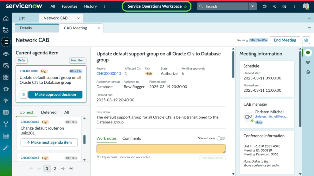
Common examples include the MIM workbench for Major Incidents (from the Washington DC release) and the CAB Workbench for the Change Advisory Board (from the Yokohama release), which were embedded into the Service Operations Workspace (SOW). Over time, they were enhanced and are now your default workbenches, providing a seamless, unified experience from a single location. You can now find many others on SOW, such as the On-Call Workbench and the Continual Improvement (CIM) Workbench.
SOW was not the only one. If you look at the recent release notes, the cleanup is massive. The Service Owner Workspace was merged into Digital Portfolio Management (DPM) Workspace since the Xanadu release. The Analyst Workbench for projects was moved under Process Mining Workspace. And all analytics artifacts, such as Data Visualizations, Dashboards, and Performance Analytics Indicators, were moved under the Platform Analytics umbrella.
On top of this interface shift, new access levels were opened up with the evolution of ServiceNow workspaces. For example, users with the Change Write role can now propose a standard change template in SOW since the Zurich release. With the Australia release and the new version of SOW, new granular admin roles were introduced to support the administrative and development work across the IT Service Management (ITSM) suite of products.
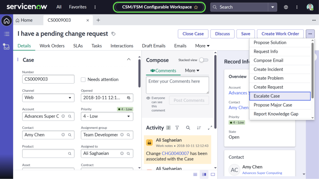
This architectural shift is also massive for vertical markets. Take the CSM/FSM Configurable Workspace. Many industry-specific solutions are built on CSM and its configurable workspace to cover vertical markets. Typical examples are financial services, healthcare and life sciences, telecommunications, manufacturing, and retail.
AI and the Push for a Better UI
It’s great to see ServiceNow’s user interfaces are finally getting the attention they deserve, and AI is playing the key role here, especially with Now Assist and ServiceNow Otto capabilities and skills.
ServiceNow workspaces have evolved significantly, especially since ServiceNow began embedding and integrating more capabilities into them. For example, you can now easily apply templates, quick messages, playbooks, coaching assessments, and follow AI recommendations and take actions.
The biggest one in my view was the Now Assist and Otto integration into workspaces, which helped agents access real-time insights, find related records, generate tasks, and trigger flows. It’s never been easier to process routine activities and let the platform do its magic while agents are working on multiple tasks simultaneously.
Now Assist and Otto and embedded AI capabilities, such as summarizing chats, generating resolution notes, and suggesting knowledge articles right within the contextual side panel, have been some of the main drivers making this new UI so demanding for platform users. This isn’t just about making things look pretty; it’s about productivity, getting seamless fulfillment, and faster resolution times.
The Fragmented Reality: Interoperability and Cross-Functional Challenges
Looking into ServiceNow workspaces, they’re all across the board: from operational ones such as the Manager Workspace to more technical ones such as the CMDB Workspace. Yet the main challenge is interoperability between workspaces and coverage for teams working across multiple practices or products.
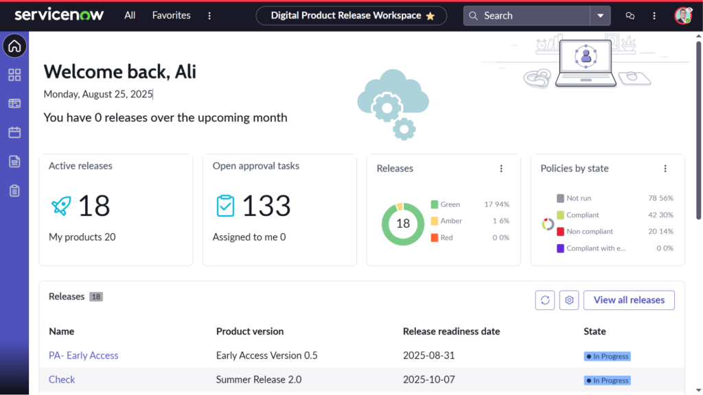
For example, for a full ITSM practice, you will need to consider beyond incident, problem, and change that the SOW offers. There’s the release management that’s being covered by the Digital Product Release (DPR) Workspace. There’s the DevOps Change Workspace that’s being used by development and operations teams. We also have the Digital Portfolio Management (DPM) Workspace and a few more. While they’re all related, they’re being offered as standalone products and workspaces!
Another challenge is with the multi-functional and cross-functional teams. Although there are overlaps in their daily duties, you cannot always find everything they need in a single workspace.
For example, we have teams that work on Strategic Portfolio Management (SPM), handling demands, projects, and agile development, while simultaneously managing IT Service Management (ITSM) tasks like incidents, problems, and changes. They may spend some time in the Project Workspace and Strategic Planning Workspace (SPW) for the SPM side, but also in the SOW for the ITSM side. We also have security teams that work on both Security Operations (SecOps) and ITSM. For these users, the current model can feel fragmented.
In my view, getting different workspaces to tap into each other in a truly seamless experience is something that’s still maturing. Sometimes it feels like I’m constantly jumping between different workspaces just to get my work done. From SPW to SOW, from DPR to DPM, from Project to Process Mining, and so on. Hence, there may not be a single workspace that can comprehensively cover all we need for our daily work.
The Heavy Maintenance Burden and UI Disconnect
There are so many ServiceNow workspaces these days; even maintaining the applications and plugins up to date is a challenge, let alone what users go through to learn them. Service Operations Workspace (SOW) is one of the big ones and gets frequent, promising updates, while others may sit there until they’re merged or disappear.
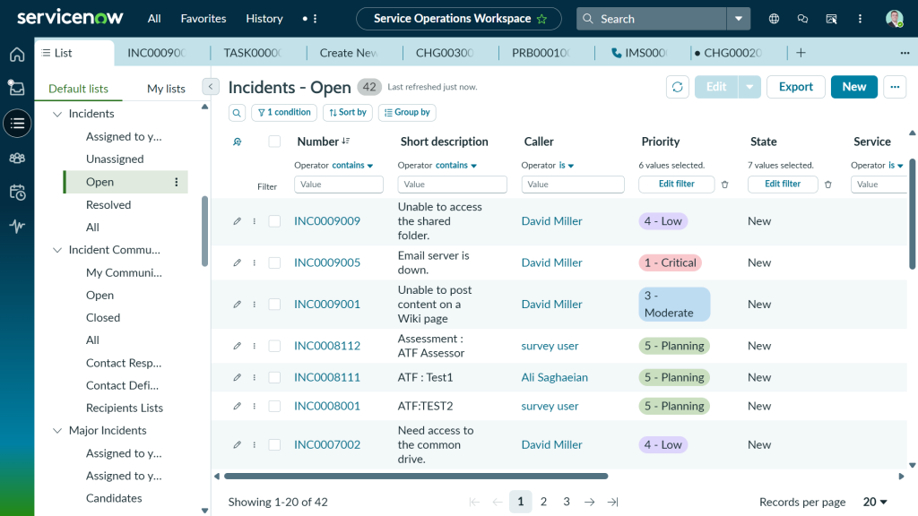
But stepping back, you may have noticed a disconnect in ServiceNow workspace UI. We don’t get consistent updates across the main ones, especially around the user interface and user experience. A good example is the list options and actions: Searching, sorting, grouping, and filtering.
You can get a completely different experience depending on where you are: e.g., Service Operations Workspace (SOW) vs. CSM/FSM Configurable Workspace. And they’re again different from the Classic UI.
Another issue is when users click on a reference field to a table that does not exist in the workspace menu, or the form view is not configured for that workspace. It could bring discrepancies and misalignment, especially from a user experience perspective; something that needs to be separately addressed.
There is so much maintenance work required to ensure the transition is smooth and the experience is seamless. Consistency is key, as not all users like surprises with every new update; something I’ve been observing in workspaces lately. And there are still a lot of gaps to cover.
Personalization vs. Enforced Landing Pages
When we deploy a new workspace, the natural instinct from a platform owner’s perspective is to standardize by building a beautiful landing page and pushing it out to everyone.
But I have learned that although it works for some organizations, in most, users tend to complain when we enforce a landing page. For example, showing them a complex dashboard designed for an IT support agent could be irrelevant and unnecessary for a user with an approver role. Ultimately, they want to see what they like and what is most practical to them.
Role-based rules remove a great deal of noise, but there is still an extra aspect where users prefer a tailored experience. There should be a factor of personalization, so users can have their own version of the workspace with the records and setup that works for them. If we lock down the UI too tightly, we remove the flexibility that users loved about the classic interface.
A great way to give this flexibility back is by integrating Platform Analytics Dashboards into workspaces. Allowing users to embed and configure their own personalized dashboards right where they work bridges the gap between a modern, unified architecture and the personal control they don’t want to lose.
Building Trust With Your Customers
So, how do we build that trust with the customers so they migrate and fully rely on ServiceNow workspaces?
Being in a similar situation for some time, trying to help various customers, here are some of my suggestions that you can consider as the key strategies:
- Don’t force a hard cutover overnight. Introduce the workspace as an alternative first.
- Focus on the “What’s in it for me?” Show the users the features they can’t get in the classic UI, or are hard to access, like Now Assist and Otto.
- Address the gaps transparently. Map out their journey so cross-functional navigation is as painless as possible.
- Give them back some control. Allow users to create their own lists and personalized visualizations.
- Prioritize training. You cannot just push a completely new interface and expect users to adapt. Walk them through live demonstrations and present them with learning materials so they actually see the benefits and feel the reduced click-path and improved efficiency.
The Administrator’s Perspective: The Classic UI Fallback
While we are pushing our fulfillers and agents into the workspaces, there is still a big gap between what users can access and achieve using the classic UI compared to the workspaces, especially as an administrator or developer. Although there are tools and workspace-like environments for admins to monitor and manage some of their work, they don’t offer the full experience.
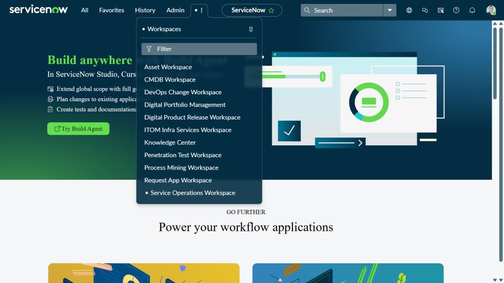
Personally, I frequently have to go back and forth between the classic view and workspaces, since not everything is in workspaces, and surprisingly, some things are easier to do in the classic UI. For example, I used to rely on the All menu to find what I needed with a simple keyword search. Now, it takes me a while to remember which specific workspace I should access to find what I need.
On top of that, there is no search box on the workspace menu to locate the application or module we need. My list of workspace menu options is growing fast as the platform scales, and there are moments when I have to pause to figure out how to navigate to my list/record. Users have already gotten used to searching in the classic UI, and as the workspaces expand, browsing is becoming a real challenge.
Having to fall back might be fine for now, given that the majority mindset is that ServiceNow workspaces are designed for service delivery and operational work, and not necessarily deep system administration. However, this could change not long from now.
Final Thoughts
It’s been an incredible journey watching the platform mature from simple lists and static forms to such dynamic, AI-driven workspaces over the last ten years. ServiceNow is heavily investing in Configurable Workspaces, and it’s great that they’re receiving updates so everything comes together in a single unified workspace view, allowing us to manage our work centrally.
This vision is exactly what the industry needs: fewer tabs, less swivel-chair activity, and a heavy emphasis on keeping agents engaged without constantly switching context.
But the reality on the ground is that enterprise architecture is messy. Cross-functional teams don’t fit neatly into a single product box, and the overhead of maintaining UI components across siloed workspaces is a legitimate hurdle for platform owners.
I still find myself switching between workspaces and back and forth to the Classic UI, which shows the transition isn’t always a clean break. At the end of the day, workspaces are the undeniable future of the platform. To get there successfully, we have to listen to our users, allow personalization, and accept that for the foreseeable future, we might just need to keep one foot in the workspaces and the other in the Classic UI, hoping the transformations and AI bring in the change we need to make the platform work for us in a true sense.